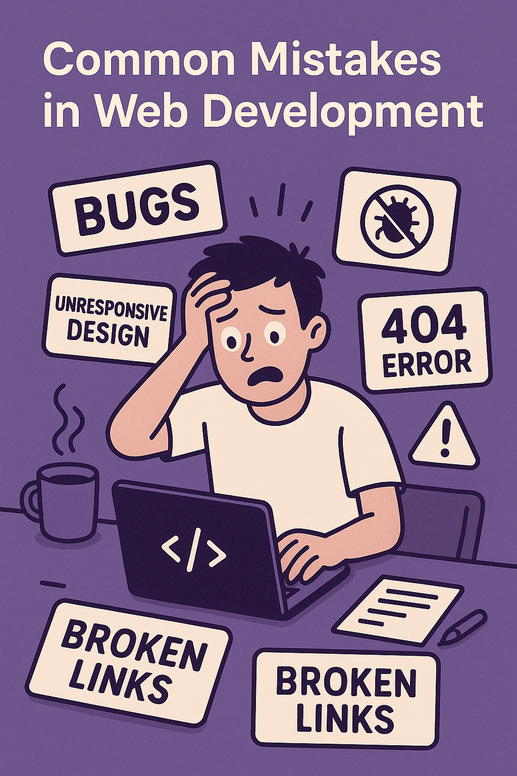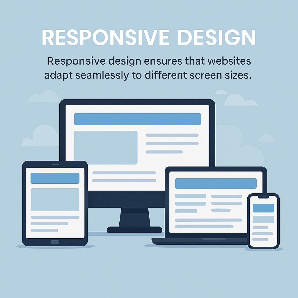
Why Responsive Design Matters 1. Improved User Experience A responsive website adjusts its layout dynamically, ensuring that content remains readable and interactive across different devices. Visitors should never struggle with zooming in or scrolling horizontally just to navigate a webpage. 2. SEO Benefits Search engines like Google prioritize mobile friendly websites. A well optimized, responsive site increases your chances of ranking higher in search results, driving more organic traffic to your platform. 3. Cost-Effectiveness Instead of creating separate versions for desktop and mobile, responsive design allows developers to maintain a single, adaptable website reducing development time and long-term maintenance costs. 4. Better Conversion Rates Whether it’s a blog, an e-commerce site, or a portfolio like yours, responsiveness ensures that users can easily browse and interact with content. A smooth mobile experience often leads to lower bounce rates and higher conversion rates. ✅ Flexible Grid Layout Use a CSS framework like Bootstrap or CSS Grid to structure content fluidly. Define breakpoints for different screen sizes. ✅ Scalable Media and Typography Ensure images are fluid (max-width: 100%) to prevent distortion. Use relative font sizes (e.g., em, rem) to scale text accordingly. ✅ Optimized Navigation Implement a hamburger menu for mobile users. Ensure buttons and links are easy to tap on smaller screens. ✅ Performance Enhancements Compress images to reduce load time. Enable lazy loading for media files to improve speed. ✅ Mobile-Friendly Testing Use browser developer tools (Ctrl + Shift + I) to preview different screen sizes. Test using services like Google’s Mobile-Friendly Test. Your website represents your expertise, and making it fully responsive will demonstrate your ability to create seamless user experiences. Implementing these improvements will keep your site professional, accessible, and ahead of modern web trends.